Think of two puzzle pieces cut to fit exactly edge-to-edge. On a table, they align perfectly. But if the table shifts just a fraction of a millimeter, the gap between them becomes visible and the image breaks. That is the problem trapping exists to solve in printing.
Every multicolor print job involves multiple plates, screens, or print stations laying down different colors in separate passes. No press on earth achieves perfect registration across an entire run. Trapping the technique of creating tiny intentional overlaps between adjacent colors keeps those inevitable registration shifts from turning into visible white gaps on the final print. It is not a design flourish. It is a production survival skill.
This guide covers trapping from first principles through to process-specific standards, with a cross-process comparison you will not find anywhere else on a single page. Whether you run a flexo press, manage prepress for offset, or evaluate machinery for a packaging line, this is written for you.
What Is Trapping in Printing?
Trapping (also called color trapping, spreads and chokes) in Chinese prepress terminology) is a prepress technique that creates a small intentional overlap between two adjacent colors in a print layout. Its sole purpose: to prevent unsightly white gaps called “flashes” or “halos” from appearing at color boundaries when the printing press inevitably shifts out of perfect registration.
To understand why trapping is necessary, you need to understand its opposite: the knockout. In multicolor printing, when a foreground object (say, yellow text) sits on a colored background (say, dark blue), the background is not printed as a solid rectangle underneath the text. Instead, a “hole” matching the exact shape of the text is cut out of the background plate. This is the knockout. The yellow text is then printed into that hole. In theory, the yellow fills the hole perfectly. In practice, the yellow plate and the blue plate almost never align to the micron. The result: a thin white gap where the paper shows through between the two colors.
Trapping fixes this by making either the foreground slightly larger (spread) or the knockout hole slightly smaller (choke), so the two colors overlap by a fraction of a millimeter. The overlap ensures that even when registration drifts, no white gap appears, because there is no gap to begin with. The overlap itself is typically invisible to the naked eye, and for one consistent reason: the lighter color always expands into the darker color.
This is not a digital-era invention. Trapping has existed for as long as multicolor printing itself, from the earliest lithographic presses to today’s high-speed flexo and gravure lines. What has changed is who does it, how it is done, and how much of it is automated. What has not changed is why it matters: print is a physical process, and physical processes are never perfect.
Why Print Registration Fails The Problem Trapping Solves
Before you can trap intelligently, you need to understand what you are trapping against. Misregistration the failure of color separations to align precisely has three families of causes. None of them can be eliminated entirely, only minimized and compensated for.
Substrate Instability
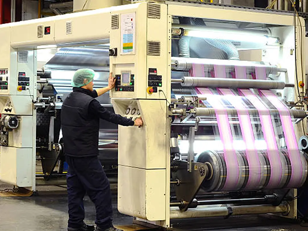
Paper and film are not inert. Paper expands and contracts with humidity. A 10% change in ambient relative humidity can cause a sheet of offset paper to grow or shrink by 0.1 to 0.3 mm across its width. That is enough to create a visible gap between colors that were perfectly aligned in the digital file. In flexographic printing on thin polymer films (PE, PP, PET), the situation is worse: web tension alone can stretch the substrate by 1% to 2% during the print run. On a 1,000 mm web width, that represents up to 20 mm of dimensional change between the first and last print stations. No trapping strategy can fully absorb that magnitude of distortion, but the right trap width can handle the residual registration error after tension control has done its best work.
Temperature compounds the problem. Heat from drying systems, friction from rollers, and even the press room’s ambient temperature fluctuation across a shift all contribute to substrate movement. A roll of film printed at 8 AM may register differently from the same roll at 2 PM.
Mechanical Variation
Every printing press has mechanical tolerances. Plate cylinders have runout. Gears have backlash. Bearings wear. Impression pressures vary across the width of the cylinder. In offset, the blanket-to-blanket nip introduces its own variability. In flexo, plate mounting tape compresses differently depending on age, durometer, and the operator who mounted it. In gravure, the chrome-plated cylinder surface gradually wears, changing the cell volume and, with it, the ink transfer characteristics.
These mechanical factors produce registration errors that range from ±0.05 mm for a well-maintained sheetfed offset press to ±0.2 mm or more for an aging stack-type flexo press running at speed. The trap width must be calibrated to the specific press, not borrowed from a textbook.
Ink Behavior
Different inks behave differently under the pressures and speeds of a production press. High-viscosity inks (like heavy opaque whites used as underbases in screen printing) stretch the screen mesh more than low-viscosity process inks, causing progressive registration drift across a print run. In wet-on-wet offset, the tack of a previously printed ink can pull fibers from the paper surface or even “pick” the ink from a preceding unit. In gravure, the solvent-based ink’s drying rate affects the dot gain and, consequently, the apparent trap width.
Trapping is not an admission that your press cannot hold register. It is the engineering acknowledgment that no press can hold perfect register, and the smart response is to design the artwork so that small registration errors are invisible rather than catastrophic.
The Core Mechanics Spread, Choke, and Overprint
When you strip trapping down to its mechanical essentials, there are only three moves. Every trapping decision in every printing process is a variation or combination of these three. The art is in knowing which to use, in which direction, and by how much.
Before examining each technique, lock in the golden rule that governs all of them: the lighter color always bears the overlap. The human visual system perceives edges primarily through luminance contrast. When a dark shape’s boundary shifts by 0.1 mm, the eye notices. When a light shape’s boundary shifts by the same amount, it passes unnoticed. This single principle determines trap direction in virtually every scenario.
Here is a quick decision framework: if the lighter element is in the foreground, use a spread. If the lighter element is the background, use a choke. If one of the colors is black, strongly consider overprint before anything else. The rest is execution.
Spread Expanding the Lighter Color Outward
A spread does exactly what it sounds like: the lighter foreground object is slightly enlarged so that it extends beyond its nominal boundary into the darker background. In vector terms, this means adding an outline stroke to the foreground object, setting that stroke to the same color as the foreground, and telling it to overprint.
The most common scenario: yellow text or a yellow logo mark sitting on a dark blue or black background. The yellow is the lighter color, so it spreads outward. The trap width (typically 0.08 to 0.16 mm for offset or 0.15 to 0.25 mm for flexo) is the thickness of that invisible outline. The human eye notices a white gap slicing through dark blue far more than a slight thickening of a light shape, so the spread passes unnoticed at normal viewing distance.
The visual cost: the overlap zone becomes a slightly darker composite of the two colors. Where yellow spreads over dark blue, the overlap takes on a faint greenish cast. This is managed through tint reduction: in professional trapping software, the overlapping portion of the lighter ink prints at 40% to 60% of its full density rather than 100%, softening the color shift until it becomes imperceptible. The exact tint reduction percentage depends on the ink set, the substrate, and the trap width. These values are calibrated per job, not set once and forgotten.
The technical parameter that governs spread direction is the CIELAB L* (lightness) value of each ink. It is not your visual estimate on an uncalibrated monitor. Two colors that look similar in lightness to the naked eye can have meaningfully different L* values when measured spectrophotometrically, and that difference determines spread direction. When in doubt, measure.
Choke Shrinking the Background to Protect the Edge
A choke is the mirror image of a spread. Instead of enlarging the foreground, you shrink the knockout hole in the background so that the darker foreground object extends slightly beyond the opening cut for it. The visual result is the same (the darker color defines the edge), but the method is different, and in certain scenarios a choke produces a cleaner result than a spread.
The classic choke scenario: a dark blue logo sitting on a white or very light background. The background is the lighter color, so it is choked inward, effectively making the knockout hole slightly smaller than the logo. The dark blue logo then overlaps the white background by the trap width, and the edge remains crisp.
In practice, the choice between spread and choke often comes down to which element is easier to modify in the artwork. If the dark foreground is a complex illustration with many paths and the background is a simple rectangle, choking the background is far simpler than spreading dozens of individual foreground elements. Choke values typically run 0.02 to 0.05 mm smaller than the equivalent spread value for the same job. This is because background shrinkage is slightly more visually detectable than foreground expansion. The eye forgives a light shape that is fractionally larger than expected more readily than a light background that seems to “creep” inward around dark shapes.
One flexo-specific nuance: when a dark solid area is printed adjacent to a light screen tint, a choke prevents the dark ink from physically flooding into the screen dots at the boundary. This is not a registration issue but a physical ink-transfer issue, and it is one reason flexo trapping tends to be more hands-on than offset trapping.
Overprint When Two Inks Share the Same Space
Overprint is the simplest trapping technique and, paradoxically, the one most frequently misused. Instead of creating an overlap zone at the boundary, overprint eliminates the boundary entirely: one ink prints directly on top of the other, with no knockout in the underlying color.
Black ink is the canonical overprint case. Black is sufficiently opaque to hide whatever lies beneath it, so black text and black line art are almost always set to overprint. This is so standard that most design applications default to black overprint, and most RIP workflows automatically overprint 100% black unless configured otherwise. The result: black elements never create knockout holes, so there is nothing to go out of register.
The danger zone is when designers or automated workflows apply overprint to non-black elements. A white object set to overprint on a dark background disappears entirely. The white ink prints, but because it is translucent, the dark background shows through and the white object vanishes on press. A yellow object overprinting on cyan produces green. Two spot colors overprinting produce an unpredictable third color that no one specified. These errors rank among the most expensive in prepress: they are invisible on screen unless Overprint Preview is explicitly enabled, and they only reveal themselves when the job is already on press.
Metal inks deserve special mention. Metallic inks (golds, silvers, bronzes) are almost entirely opaque. They should never be overprinted by another color. Instead, all adjacent colors must trap toward the metallic ink, regardless of relative luminance. The metallic ink defines the edge, full stop.
Trapping Across Printing Processes A Side-by-Side Comparison
This section is the core of this guide and, to our knowledge, the only place on the web where the trapping requirements of all five major printing processes are compared side by side in a single reference table.
Your trapping strategy is not dictated by your design software. It is dictated by the press the job will run on. Before you study the comparison below, answer three questions about your production environment:
- Is your press sheetfed or web-fed?
- What substrate are you printing on coated paper, plastic film, corrugated board, or textile?
- What is the typical registration accuracy of your press under normal production conditions (not the manufacturer’s specification under ideal test conditions)?
Your answers to these three questions map directly to the trap value recommendations and special considerations in the table below.
| Dimensi | Litografi Offset | Fleksibilitas | Rotogravure | Digital (Toner/Inkjet) | Sablon |
|---|---|---|---|---|---|
| Typical registration accuracy | ±0.03 0.05 mm (sheetfed) ±0.05 0.08 mm (web) |
±0.10 0.20 mm (stack type) ±0.05 0.10 mm (CI type) |
±0.05 0.10 mm | ±0.02 0.05 mm (negligible misregistration between colors within same print engine) | ±0.20 0.50 mm (varies heavily with screen tension and off-contact) |
| Recommended trap width | 0.08 0.16 mm (coated) 0.10 0.20 mm (uncoated) |
0.15 0.25 mm (film/paper) 0.25 0.40 mm (corrugated) |
0.10 0.20 mm | Typically not required for native digital output | 0.25 0.75 pt (textile) 0.15 0.40 pt (rigid substrate) |
| Core trapping challenge | Ink-water balance affects substrate dimensional stability; wet-on-wet trapping complicates overprint behavior | Substrate stretch and plate deformation are the dominant variables; CI presses hold better registration than stack-type | Chrome cylinder wear shifts cell volume and dot gain over the run; solvent drying rate affects ink spread | Electrophotographic and inkjet processes print all colors within a single engine pass, eliminating inter-unit registration | Screen mesh tension loss and off-contact distance drift across production runs; thick ink deposits amplify registration errors visually |
| Automation maturity | High in-RIP trapping engines (Kodak Prinergy, Heidelberg Prinect, Fuji XMF) handle most offset scenarios automatically | Medium approximately 50% of flexo prepress work involves some form of manual or human-assisted trapping; automated trapping often falls short for complex packaging layouts | High dedicated gravure trapping modules in prepress software handle most scenarios; drying and dot gain are the bigger variables | Very high digital presses do not need inter-color trapping; trapping is only required when digital output is combined with post-print processes (e.g., digital + flexo spot color) | Low the majority of screen printing trapping is done manually in design software (Illustrator, CorelDRAW) |
| Special considerations | Wet-on-wet printing requires trap direction to account for ink tack and transfer sequence | Keepaway/stayaway choke essential for rich black edges; vignettes must not fade below 3 4% dot in flexo; barcodes oriented in web direction for readability | Sliding trap required for gradients; metallics always receive trap (never overprint) | If combining digital with conventional post-print (flexo varnish, screen metallic), treat the post-print process as the trapping reference | Opaque underbase white distorts more than top colors; trap values may need to double for high-opacity ink systems |
Beyond the table, two cross-process insights deserve emphasis. Both affect machinery and production decisions, not just prepress settings.
First, the difference between central impression (CI) flexo and stack-type flexo carries real weight for trapping. A CI press wraps the substrate around a single large-diameter drum, with all print stations arranged around it. Because the substrate is locked to the drum, registration accuracy between stations is typically 2× to 3× better than a stack-type press, where the web travels between independently positioned stations. This means a CI flexo press can run with trap widths at the lower end of the flexo range (0.10 0.15 mm on film), while a stack press on the same substrate may need 0.20 0.25 mm. The narrower trap enabled by CI architecture is not just a prepress convenience. It is a competitive differentiator in markets where buyers judge quality by the crispness of fine text and the cleanliness of color transitions. Every packaging converter should understand this relationship between press architecture and achievable print quality before making a capital equipment decision.
Second, digital printing has largely eliminated in-process trapping. But the trap-free promise breaks down the moment a digitally printed job goes through a conventional post-print process. A digitally printed label that receives a flexo-applied spot varnish, a screen-printed metallic accent, or a foil stamp requires trapping at those post-print touchpoints. In such hybrid workflows, the trapping reference is always the conventional process, not the digital engine.
Trap Width Standards Getting the Numbers Right
Knowledge of how trapping works is necessary but not sufficient. At some point, someone needs to put a number on the trap width, and that number needs to be right. Too small, and gaps persist. Too large, and every color boundary develops a visible dark halo. This section provides both the logic and the specific reference values.
The Logic Behind the Numbers
Trap width is not an arbitrary aesthetic choice. Four variables determine it, and your job is to understand how each one pulls the number up or down:
Press registration accuracy is the dominant variable. A press that consistently holds ±0.05 mm can use a smaller trap than one that drifts to ±0.15 mm. The accepted rule of thumb: your minimum trap width should be twice your measured maximum misregistration. If your worst-case registration error on a production run is 0.08 mm, set your trap to 0.16 mm. This “doubling rule” provides a safety margin that accounts for day-to-day variability, operator differences, and gradual press wear between maintenance cycles.
Substrate stability is the multiplier. On stable substrates (coated paper in a climate-controlled pressroom), stick close to the base value. On unstable substrates (thin PE film running through an un-air-conditioned flexo hall in summer), add 30% to 50%. On corrugated board the least dimensionally stable substrate in common use double the base value.
Screen ruling (lpi) sets the floor. A trap cannot be narrower than the diameter of a single halftone dot at the screen ruling in use. At 150 lpi, a single dot is approximately 0.17 pt (0.06 mm) in diameter. Set a trap narrower than this, and the trap itself becomes invisible. It literally disappears into the dot structure of the printed image.
Color contrast sets the visibility ceiling. High-contrast color pairs (yellow on black, white on navy) make gaps more visible to the eye, which argues for a slightly larger trap. Low-contrast pairs (two similar blues) make the trap itself more visible if overdone, which argues for restraint. When one of the colors is black, increase the trap width by 1.5× to 2×. Black’s visual dominance means a white gap against black screams louder than any other registration error.
Process-Specific Reference Values
The following reference table provides starting-point trap values. These are not universal constants. They are calibration starting points. Every print shop should run its own registration test and adjust accordingly.
| Proses Pencetakan | Substrate Type | Screen Ruling (lpi) | Recommended Trap Width (mm) | Recommended Trap Width (pt) | Notes |
|---|---|---|---|---|---|
| Offset Sheetfed | Coated paper (gloss/silk) | 150 175 lpi | 0.06 0.10 mm | 0.17 0.28 pt | Smallest practical trap for high-quality commercial work |
| Offset Sheetfed | Uncoated paper | 120 150 lpi | 0.10 0.15 mm | 0.28 0.43 pt | Larger trap compensates for higher absorbency and dimensional instability |
| Offset Web (heatset) | Coated paper | 133 150 lpi | 0.08 0.12 mm | 0.23 0.34 pt | Web tension adds a longitudinal registration variable |
| Flexo CI press | Film (PE, PP, PET) | 100 133 lpi | 0.10 0.18 mm | 0.28 0.51 pt | CI architecture enables tighter traps than stack flexo |
| Flexo CI press | Kertas | 100 120 lpi | 0.12 0.20 mm | 0.34 0.57 pt | Paper in flexo is less dimensionally stable than film |
| Flexo Stack press | Film | 85 110 lpi | 0.18 0.25 mm | 0.51 0.71 pt | Stack press registration variance demands larger safety margin |
| Flexo Stack press | Corrugated board | 55 85 lpi | 0.25 0.40 mm | 0.71 1.14 pt | Largest trap values in common use; coarsest screen rulings |
| Gravure | Film (PE, PP, PET) | 100 150 lpi | 0.10 0.18 mm | 0.28 0.51 pt | Gravure registration accuracy is good but solvent drying adds variability |
| Gravure | Kertas | 100 133 lpi | 0.12 0.20 mm | 0.34 0.57 pt | Paper dimensional change during drying must be factored in |
| Digital | N/A (native digital output) | N/A | Not required | Not required | Only needed when digital output combines with conventional post-print processes |
| Layar | Textile (cotton, polyester) | 45 85 lpi | 0.18 0.35 mm | 0.50 1.00 pt | Larger traps for high-opacity inks and coarse mesh counts |
| Layar | Rigid substrate (acrylic, metal, glass) | 65 100 lpi | 0.10 0.20 mm | 0.28 0.57 pt | Rigid substrates eliminate fabric stretch; can use tighter traps |
Special Cases That Break the Rules
Three scenarios routinely surprise even experienced prepress operators because they violate the standard logic:
Rich black black ink boosted with a percentage of cyan, magenta, or yellow underneath to deepen its visual density is a trapping trap. The problem: if the underlying CMY colors extend to the edge of the black shape and the press shifts, a colored fringe (typically cyan or magenta) peeks out from beneath the black. The fix is a keepaway (also called stayaway) choke: choke the underlying CMY colors back by 0.08 to 0.15 mm from the black edge, so that only pure black defines the visible boundary. The standard rich black formula is 100K + 40C, but different printers use different recipes. Always confirm with your prepress provider.
Metallic inks invert the standard luminance rule. Metallic inks are highly opaque. Adjacent colors cannot overprint them because there is no transparency to work with. Instead, all non-metallic colors must trap toward the metallic, regardless of which is lighter or darker. The metallic ink defines the visual edge, period. This applies equally to gold, silver, and any custom metallic blend.
Gradients and vignettes demand a sliding trap a trap whose width changes along the length of the gradient in proportion to the local color density. Where the gradient is dark, the trap is narrower. Where it fades, the trap widens. This is computationally non-trivial and cannot be done in Adobe Illustrator or InDesign natively. It requires dedicated trapping software (Esko ArtPro+, Kodak Prinergy, Hybrid PACKZ, or equivalent) with gradient-aware trapping algorithms. In flexo, an additional gradient rule applies: never fade a vignette below 3% to 4% dot coverage. Flexo plates cannot reliably hold dots below this threshold, and the resulting “dot bridging” creates an ugly hard edge where the gradient was supposed to fade smoothly to zero.
Why Trapping Matters for Your Production Bottom Line
Trapping can feel like a narrow technical concern. A prepress operator’s problem, handled somewhere between file receipt and plate output. But seen through the lens of production economics, trapping is a direct cost driver. It affects waste rates, machine utilization, customer approval cycles, and for packaging converters investing in new equipment the long-term return on a six- or seven-figure capital decision.

The Real Cost of Poor Trapping
Consider a flexo packaging line running a 6-color job on thin PE film at 200 m/min. A typical flexible packaging converter might run 30 to 50 such jobs per month across multiple presses. If trapping is consistently underspecified by even 0.05 mm, it does not take much for white gaps to appear. A tension spike. A humidity shift. An older plate that has lost some durometer. When gaps appear, the entire roll segment is scrap.
Industry data suggests that packaging printing waste rates average 3% to 5% of total material throughput, with registration-related defects (including trapping failures) accounting for approximately 20% to 30% of that waste. For a mid-size converter processing 500,000 linear meters of film per month at an average material cost of $0.15 per meter, that translates to $4,500 to $11,250 per month in registration-related material waste alone. This does not include the labor cost of rework, the machine time lost to restarts, or most painfully the customer goodwill burned when a shipment is delayed because a job had to be reprinted.
Equipment Precision as a Trapping Strategy
Here is a relationship rarely articulated but deeply relevant to machinery purchasing decisions: press registration accuracy and trap width are inversely proportional. A press that holds ±0.05 mm can use a trap of 0.10 mm. A press that holds ±0.15 mm needs a trap of 0.30 mm. The difference (0.20 mm of additional overlap) may sound trivial, but it directly limits the minimum printable detail. Fine text, small reverse-outs, delicate line work, and high-LPI screen work all become impossible when the trap consumes a significant fraction of the feature size.
This is why the choice between press architectures is also, implicitly, a choice about the range of print quality the converter can offer. CI flexo presses, with their single-drum substrate control, consistently deliver registration accuracy 2× to 3× better than stack-type presses. The narrower trap enabled by CI architecture is not just a prepress convenience. It is a competitive differentiator in markets where buyers judge quality by the crispness of fine text and the cleanliness of color transitions. Similarly, modern servo-driven gravure presses with automatic register control can maintain ±0.05 mm accuracy across an entire roll, enabling trap values at the bottom of the gravure range and expanding the addressable design complexity of each job.
When sourcing flexo and gravure printing machinery, evaluating the press’s registration accuracy specification and, more importantly, its real-world registration consistency over extended runs should be part of the technical assessment alongside speed, width, and dryer capacity. The trap width you can run is a direct function of the press precision you invest in. Equipment manufacturers who offer customized machinery solutions with one-stop flexible packaging equipment lines can help converters assess these variables during the specification phase, matching press architecture to the precision requirements of their target print work.
Building a Trapping Standard in Your Organization
The single highest-return action most print businesses can take on trapping costs nothing: write down a trapping standard. A one-page document specifying trap widths by press, by substrate, and by color scenario transforms trapping from an individual operator’s intuition into an organizational asset.
A trapping standard should include, at minimum: the default trap width for each press-substrate combination in your shop; the keepaway specification for rich blacks; the trapping rule for metallic inks; the minimum dot percentage for flexo vignettes; and a clear instruction that any exception must be approved by a supervisor. This document does not need to be long, but it needs to exist, be accessible on the production floor, and be enforced.
The return: fewer trapping-related press stops, less material wasted on trial-and-error trap adjustments, faster prepress throughput (operators follow a spec rather than making judgment calls on every file), and a stronger hand in customer conversations. “We print to documented trapping standards” carries weight in a supplier audit in a way that “our guys know what they are doing” does not.
Referensi
- Flexographic Technical Association (FTA). “FIRST Flexographic Image Reproduction Specifications & Tolerances.” https://www.flexography.org/
- Kodak. “Prinergy Workflow Help Trap Tool.” https://workflowhelp.kodak.com/
- Adobe Systems. “A Guide to Trapping.” https://www.adobe.com/studio/print/pdf/trapping.pdf
- ISO. “ISO 12647-2: Graphic technology Process control for the production of halftone color separations.” https://www.iso.org/standard/75372.html
- Smithers. “The Future of Package Printing to 2028.” https://www.smithers.com/
- Screen Printing Magazine. “How to Trap Artwork for Screen Printing.” https://screenprintingmag.com/how-to-trap-artwork-for-screen-printing-4-essential-steps-to-avoid-gaps-and-misregistration/
- Algonquin Design. “Trapping.” https://cg.algonquindesign.ca/information/trapping
- KETE GROUP. “Flexo and Gravure Printing Machinery.” https://www.ketegroup.com/
- KETE GROUP. "Kontak." https://www.ketegroup.com/contact/