Giriş
Modern endüstriyel ortamda rengin yeniden üretimi sadece estetik bir görev değil, aynı zamanda sıkı bir mühendislik ve maliyet tasarrufu çabasıdır. Çeşitli coğrafi pazarlarda tekdüzelik gerektiren küresel tedarik zincirleriyle birlikte baskı endüstrisi, proses rengi adı verilen standartlaştırılmış bir metodolojik yaklaşıma yönelmiştir. Bu sistem, her yıl milyarlarca ambalaj biriminde dijital amacı fiziksel gerçekliğe dönüştüren evrensel görsel dildir.
Üreticiler ve marka sahipleri için, zanaatkar renk karıştırmadan dört renkli proses baskının sistematik kullanımına geçiş ve yüksek kaliteli bir renkli proses görüntüsü elde etmek, ölçeklenebilirlik ve öngörülebilirliğe doğru kritik bir adımdır. Bu kılavuz, proses rengin, mekanik uygulamasının ve endüstriyel baskı endüstrisi üzerindeki kapsamlı etkisinin ayrıntılı bir analitik çerçevesidir.
Proses Renk Nedir?
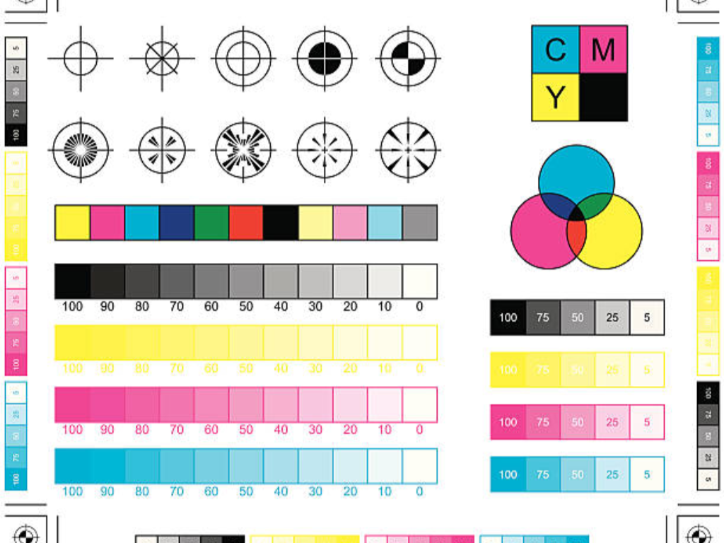
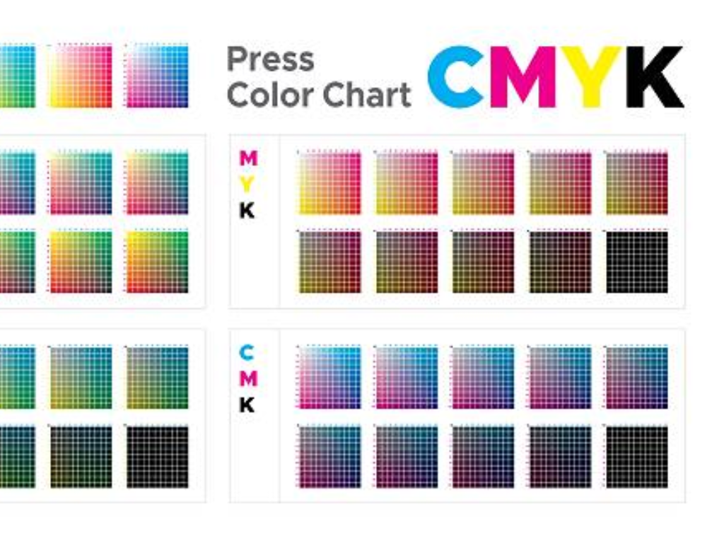
En basit haliyle, dört renkli proses veya CMYK olarak da bilinen proses renk, renkli baskıda eksiltici bir renk modelidir. Dört mürekkep pigmentinin kimyasal ve optik özelliklerine dayanan bir sistemdir: Cyan (C), Magenta (M), Yellow (Y) ve Black (K). Işığın renk oluşturmak için karıştırıldığı dijital ekranların eklemeli renk modelinin (RGB) aksine, baskı, beyaz bir alt tabakadan belirli ışık dalga boylarını kaldıran bir işlemdir. Eksiltici renk modeli, ışığı mürekkep katmanlarından izleyicinin gözüne geçirerek filtreleyen bir filtredir.
Bu dört renk rastgele seçilmemiştir, ışığın fiziğinde bir temeli vardır. Camgöbeği kırmızıyı emer, yeşil ve maviyi yansıtır; Macenta yeşili emer, kırmızı ve maviyi yansıtır; Sarı maviyi emer, kırmızı ve yeşili yansıtır. Teorik olarak C, M ve Y'nin mükemmel bir siyah oluşturması gerekirdi. Ancak, fiziksel pigmentlerin safsızlıkları nedeniyle, karışım genellikle doymamış koyu bir kahverengi üretir. Sonuç olarak, özellikle metin ve gölge alanlarında yoğunluk, derinlik ve yapısal keskinlik vermek için "Anahtar" renk olan Siyah eklenir. Bu dört renk sistemi, renk ayrımı adı verilen bir işlemle görünür renk aralığının büyük bir bölümünü yeniden üretmenin temelidir.
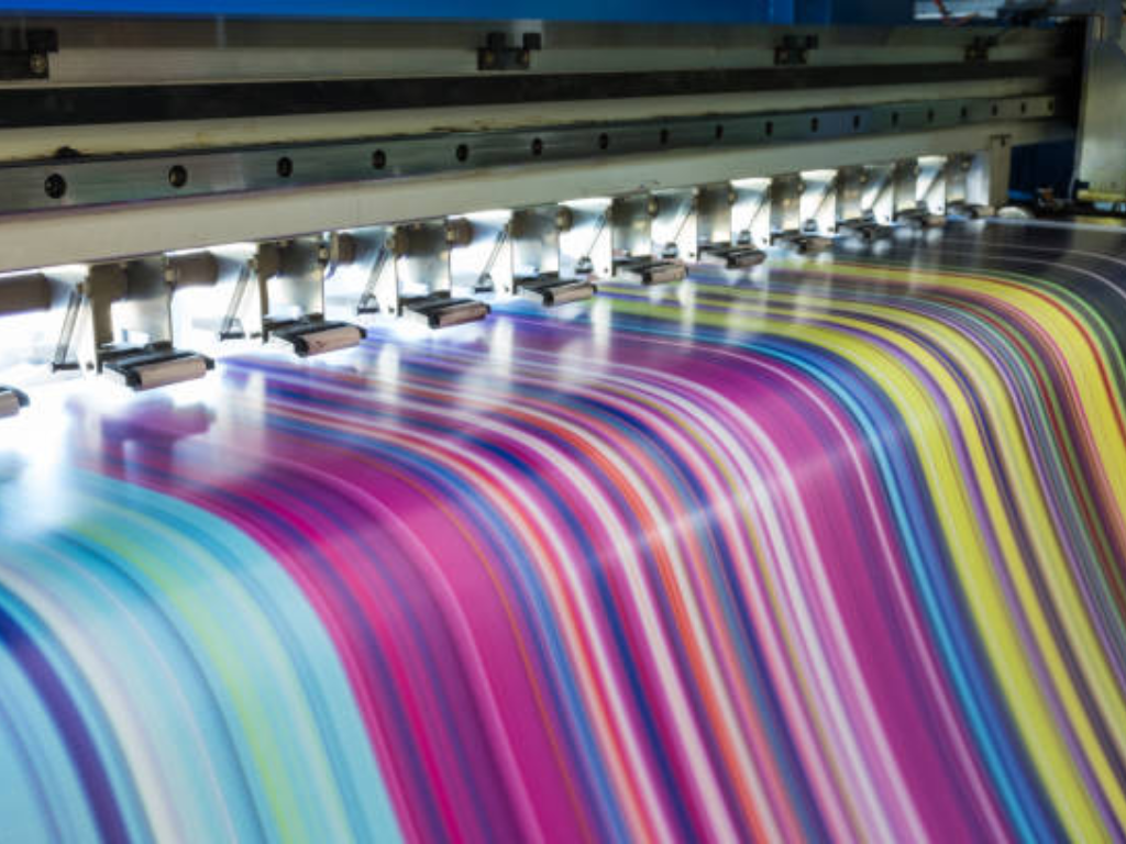
Proses Renk Nasıl Çalışır? Yarım Ton Noktaların Bilimi
Karmaşık, çok tonlu görüntülerin yalnızca dört mürekkep kullanılarak çoğaltılması yarı ton teknolojisinin kullanılmasıyla mümkün hale gelmiştir. Bir baskı makinesi ikili bir sistem olduğundan, yani mürekkep uygulayabildiğinden ya da uygulamadığından, bir alt tabaka üzerinde tek bir mürekkep renginin doygunluğunu doğal olarak değiştiremez. Ton değişimini yeniden üretmek için görüntü, yarım ton ekranı adı verilen bir doğruluk mozaiğine ayrılır.
Ekran Açıları ve Nokta Örtüşmesinin Rolü
Proses renginin performansı, bu yarım ton noktalarının uzamsal dağılımına bağlıdır. Belirli renklerin ve çeşitli renklerin noktaları doğrudan birbirinin üzerine veya rastgele bir şekilde basıldığında, etki renklerin kaotik bir şekilde karışması veya Moiré adı verilen istenmeyen girişim desenlerinin ortaya çıkması olacaktır. Bunu önlemek için, dört renk plakasına belirli bir ekran açısı tahsis edilir.
Standart endüstriyel konfigürasyonlar tipik olarak Cyan için 15°, Magenta için 75°, Sarı için 0° veya 90° ve Siyah için 45° gibi açılar kullanır. Bu ofsetler, noktaların rozetler, küçük daireler oluşturmasını sağlar ve bu da gözün sürekli bir ton olarak algılamasına neden olur. Algılanan nihai rengi oluşturmak için noktaların üst üste gelmesini ve birbirine yakın olmasını sağlamanın en iyi yolu; belirli bir alanda yüksek yoğunlukta Macenta ve Sarı noktalar turuncu olarak algılanacaktır. Bu geometrik kompozisyonun doğruluğu mutlaktır çünkü birkaç derecelik bir sapma bile tüm görsel ürünü mahvedebilir.
Görsel Algı: İnsan Gözü Renkleri Nasıl Görür?
CMYK baskının son aşaması baskı makinesinde değil, insan beyninde yapılır. Buna uzaysal parçalı renk karıştırma denir ve insan gözünün düşük çözümleme gücünden yararlanır. Göz, normal görüş mesafelerinde tek tek yarım ton noktalarını göremez. Bunun yerine Cyan, Magenta, Yellow ve Black'in ayrı değerlerini tek bir renkte birleştirir.
Pürüzsüz degradelerin, ten tonlarının ve karmaşık dokuların algılanması bu psikolojik entegrasyon sayesinde mümkündür. Dolayısıyla proses renk başarısı, baskının nokta bütünlüğünü koruma kabiliyetine göre belirlenir. Bir nokta bulanıklaştırıldığında veya büyütüldüğünde, optik entegrasyon gerçekleşemez ve ton ve detay kaybı meydana gelir. Bu nedenle, baskı makinesinin mekanik stabilitesi görsel algı denklemindeki en önemli değişkendir.
Proses Renk vs Spot Renk: Hangisini Seçmelisiniz?
Proses renk ve spot renk arasındaki karar, estetik ihtiyaçların finansal sınırlamalara karşı tartıldığı bir baskı çalışmasının stratejik planlamasında temel bir karardır. Bu seçeneği anlamak için, spot rengin önceden karıştırılmış reçetesini proses rengin dört bileşenli kileriyle karşılaştırmak gerekir.
| Karşılaştırma Metriği | Proses Renk (CMYK) | Spot Renk (Pantone) |
| Renk Gamutu | CMYK karıştırma aralığı ile sınırlıdır. | Son derece geniş (Floresanlar, Metalikler). |
| Tutarlılık | Basın istikrarına ve tesciline bağlıdır. | Farklı partiler arasında mutlak tutarlılık. |
| Maliyet (Çok renkli) | Karmaşık/fotoğraf görüntüleri için yüksek verimlilik. | Daha yüksek maliyet (Her renk yeni bir istasyon gerektirir). |
| Kurulum Süresi | Daha hızlı (Standartlaştırılmış mürekkep yükleme). | Daha yavaş (Özel mürekkep karışımı ve yıkama gerektirir). |
| En İyi Kullanım Alanları | Gerçek hayattan fotoğraflar, gradyanlar, çok tonlu sanat. | Marka logoları, kurumsal renkler, düz renk tonları. |
Hassasiyet ve Maliyet Verimliliği
Pantone Eşleştirme Sistemi (PMS) olarak da bilinen spot renk, belirli bir renk tonu üretmek için tasarlanmış tek bir hazır mürekkebin kullanılmasıdır. Bu, eşsiz bir renk tutarlılığı ve CMYK'dan daha geniş bir gamut (bir sistemin üretebileceği renk aralığı) sağlar. Bununla birlikte, her spot rengin ayrı bir baskı istasyonuna ihtiyacı vardır, bu da baskıyı daha karmaşık hale getirir.
Proses renk ise geniş bir renk yelpazesini yeniden üretmek için dört mürekkepten oluşan sabit bir paletten yararlanır. Pantone kütüphanesinde bulunan çok canlı turuncuları veya derin morları üretemeyebilir, ancak çok renkli veya fotoğrafik çalışmalarda fiyat etkinliği benzersizdir. Spot renk sistemine tek bir renk eklemenin marjinal maliyeti yüksektir, ancak CMYK gamı içinde olduğu sürece proses renk sisteminde yeni bir renk basmanın marjinal maliyeti esasen sıfırdır.
Ambalajlamada Uygulama Senaryoları
Tasarımın niteliği genellikle kararı belirler. Proses renk, gıda ambalajları da dahil olmak üzere yüksek doğruluklu fotoğraf reprodüksiyonlarında gereklidir. İnsan gözü doğal dokuların ayrıntılarına karşı çok hassastır ve bunları yeniden üretmek ancak CMYK tarafından sağlanan binlerce ton varyasyonunun yardımıyla mümkündür.
Buna karşılık, kurumsal marka ve logolar genellikle spot renkler gerektirir. Bir markanın kimliği genellikle oluklu bir kutu, plastik bir film veya kağıt bir etiket üzerine basıldığında aynı görünmesi gereken belirli, değiştirilemez bir renkle ilişkilendirilir. Çoğu üst düzey ambalajda hibrit bir çözüm yaygındır: Görüntüyü basmak için CMYK renginin kullanıldığı ve markanın logosunun tüm platformlarda tamamen aynı olmasını sağlamak için özel bir spot rengin kullanıldığı "4 renkli işlem artı bir".
Ekonomik Etki: Ambalajda Neden 4 Renk Prosesi Hakim?
Endüstriyel verimlilik ve yalın üretim mantığı, dört renkli inkjet prosesinin küresel ambalaj endüstrisinde bu kadar baskın olmasının nedenidir. Tedarik ve envanter açısından bakıldığında, dört ana mürekkepten (C, M, Y, K) oluşan bir stoğa sahip olmak, yüzlerce özel spot renk mürekkepten oluşan bir kütüphaneye sahip olmaktan çok daha ucuzdur. Envanterin bu şekilde basitleştirilmesi doğrudan daha iyi nakit akışına ve daha az israfa dönüşür, çünkü özel mürekkeplerin tarihinin geçme ihtimali yoktur.
Ayrıca, proses renk baskı kurulumlarının standartlaştırılmasını sağlar. Mürekkep fıskiyelerini, merdaneleri yıkamak ve rengi kalibre etmek için gereken zaman olan hazır hale getirme süresi, spot renk ağırlıklı bir ortamda önemli bir verimlilik kaybıdır. Proses renk altında, dört ana istasyon yüklenir ve kalibre edilir. Bu, baskı adedinin azaldığı ve SKU çeşitliliğinin arttığı bir dünyada kritik bir gereklilik olan hızlı iş değişikliklerini mümkün kılar. Kurulum sırasında kazanılan zaman ve boşa harcanan mürekkep miktarındaki azalma, proses rengi yüksek hacimli ambalaj üretiminde ekonomik açıdan en uygun model haline getirmektedir.
Proses Renkli Baskıda Kritik Teknik Zorluklar
Teorik olarak zarif bir süreç olmasına rağmen, proses renginin fiziksel uygulamasının mekanik ve akışkan-dinamik sorunları sıkıntılıdır. Dijital piksellerin bir alt tabaka üzerinde mürekkebe geçişinde kullanılan fiziksel kuvvetler, istenen sonucu bozabilir.
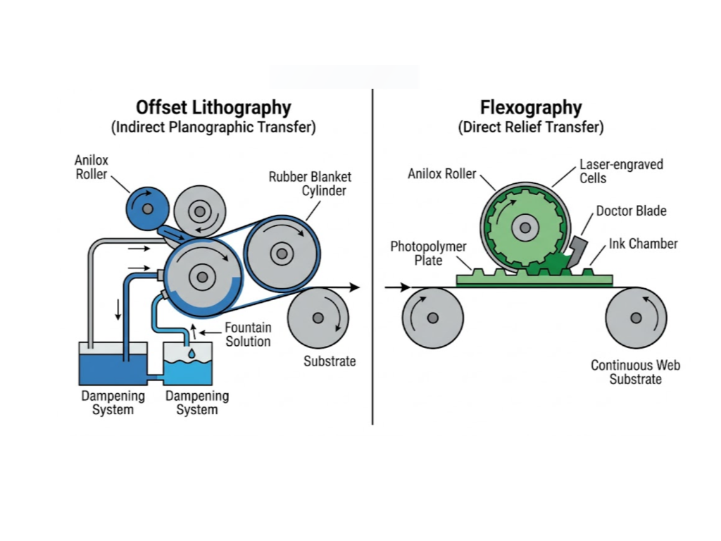
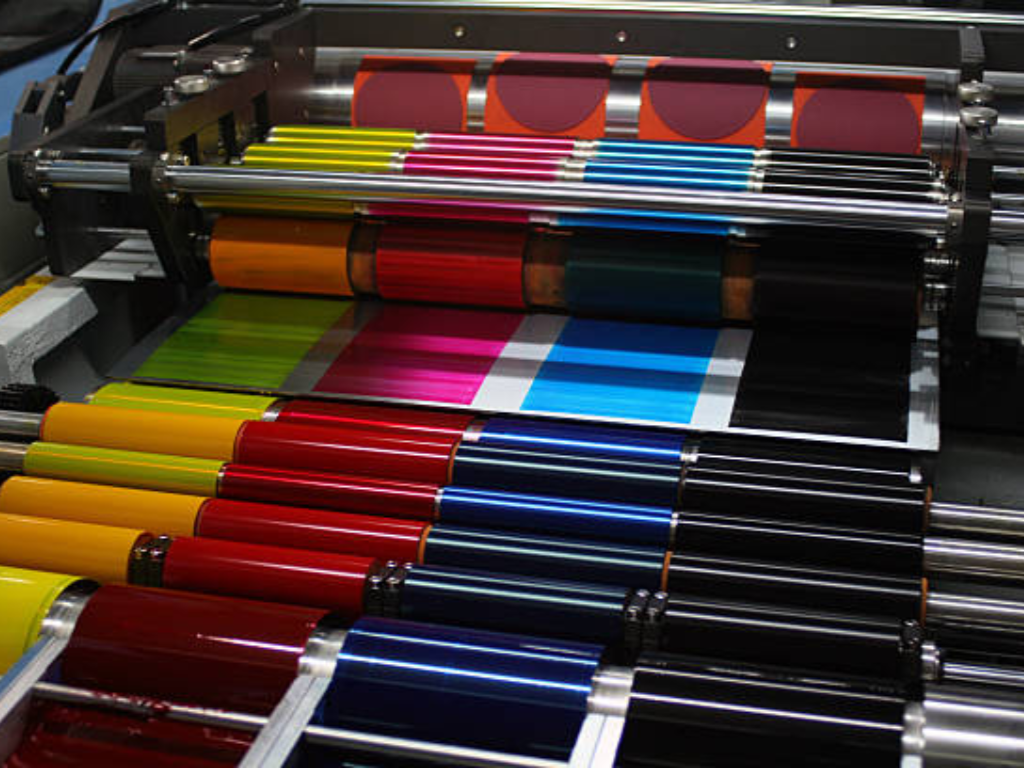
Flekso'nun Savaşı: Nokta Kazancını Yönetmek
Nokta kazancı (veya Ton Değeri Artışı, TVI) flekso baskıdaki ana sorundur. Flekso, basınca dayalı bir kabartma baskı işlemi olduğundan, mürekkebin esnek bir plakadan bir alt tabakaya aktarılması işlemi yarı ton noktalarının genişlemesine neden olur. Basınç dikkatli bir şekilde düzenlenmediği takdirde, yüzde 50'lik bir yarım ton nokta baskı altı malzemesinde yüzde 70'e kadar büyüyebilir ve bu da vurgu detayının kaybolmasına ve renk doygunluğunda radikal bir değişikliğe neden olur. Bu sıkışmayı kontrol etmek için, beklenen genişlemeye karşı koyan yüksek hassasiyetli montaj ve sofistike plaka yapım teknolojilerine sahip olmak gerekir.
Gravürün Önündeki Engel: Eksik Noktalar ve Hücre Tutarlılığı
Rotogravür baskı, aşırı detay elde edebilmesine rağmen, en önemlisi eksik noktalar veya karlanma olmak üzere kendi zorluklarına sahiptir. Bu, genellikle yüzey gerilimi sorunları veya alt tabakanın pürüzlülüğü nedeniyle mürekkebin kazınmış silindirin mikroskobik hücrelerinden alt tabaka üzerine hareket etmemesinden kaynaklanır. Proses renkte, Cyan plakadaki tek bir eksik nokta, yeşil bir manzaranın tüm alanını beklenmedik bir şekilde sarıya dönüştürebilir. Hücrenin tutarlılığı ve mürekkebin yüzde 100'ünün aktarılması, proses renkli görüntünün bütünlüğü açısından önemlidir.
Ortak Mücadele: Çok Renkli Hizalama için Hassas Kayıt
Kayıt, tüm yüksek hızlı baskı tekniklerinde ortak olan en zorlu görevdir. Dört renk plakasının milimetrenin altında bir hassasiyetle hizalanması ve alt tabakanın keskin bir proses renkli görüntü oluşturmak için dakikada 300 metreyi aşabilen hızlarda hareket etmesi gerekir. Milimetrenin bir kısmındaki herhangi bir sapma, bulanık görüntülere, renk saçaklanmasına (haleler) ve metin okunabilirliğinin kaybına neden olan mekanik bir uyumsuzluk senfonisi üretir. Bu, bir matbaa mühendisliğinin son testi olan alan senkronizasyonudur.
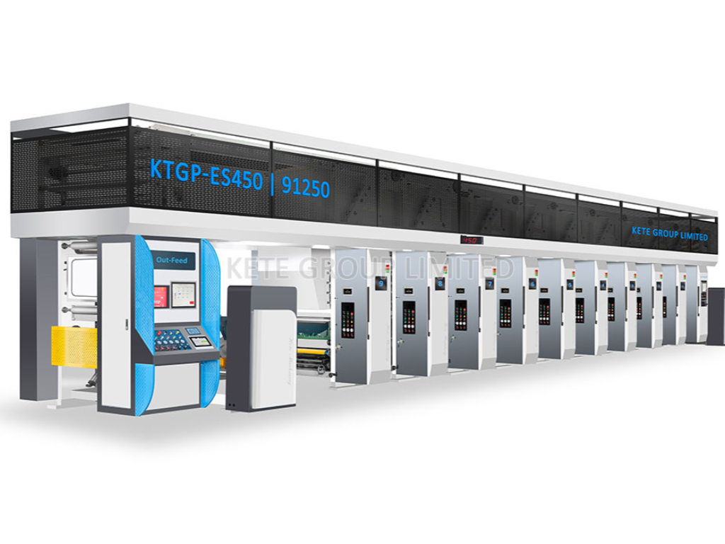
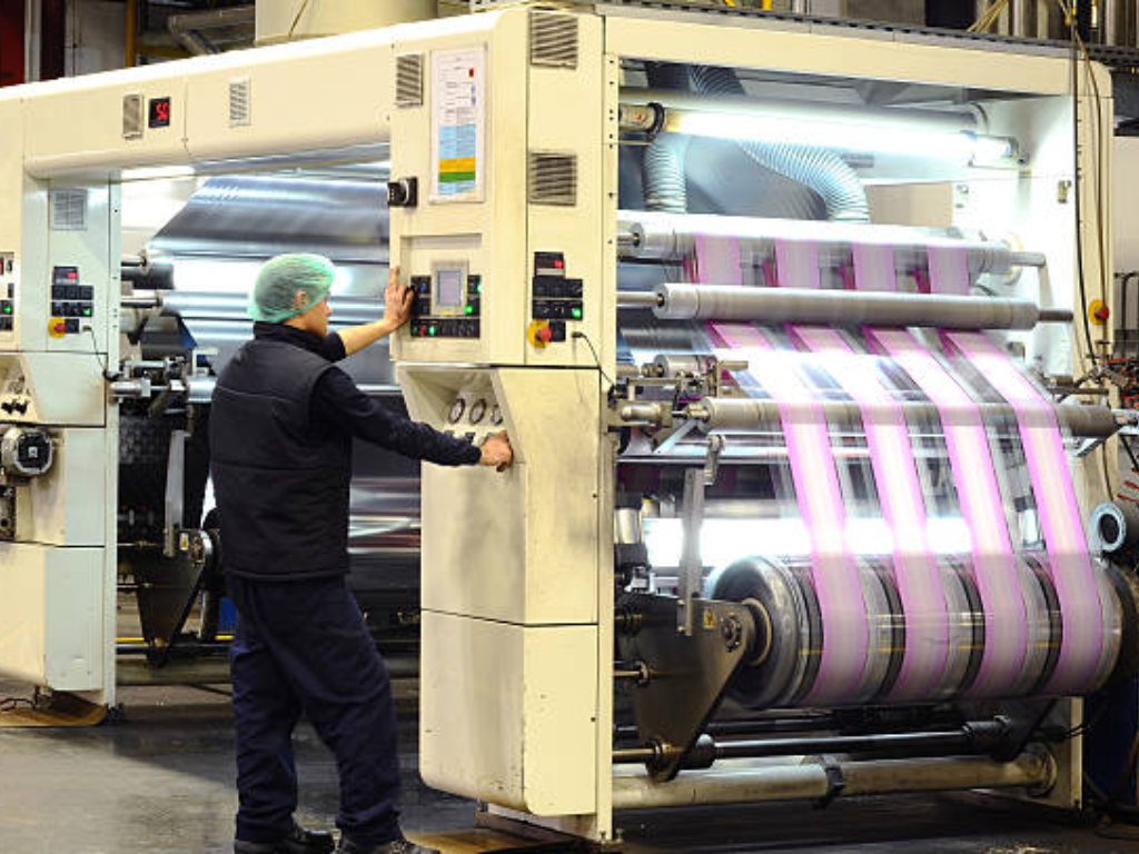
Kete'nin Çözümü: Yüksek Hassasiyetli Preslerle Mükemmel Proses Rengi Elde Etmek
Kete'de, proses rengin teorik faydalarının ancak üstün mekanik uygulama ile gerçekleştirilebileceğinin farkındayız. Fleksografik ve rotogravür baskı makinelerimiz, proses renk reprodüksiyonunun doğasında bulunan özel "sürtünmeyi" ele alacak şekilde tasarlanmıştır.
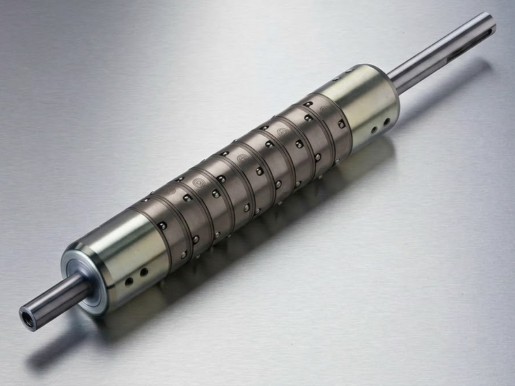
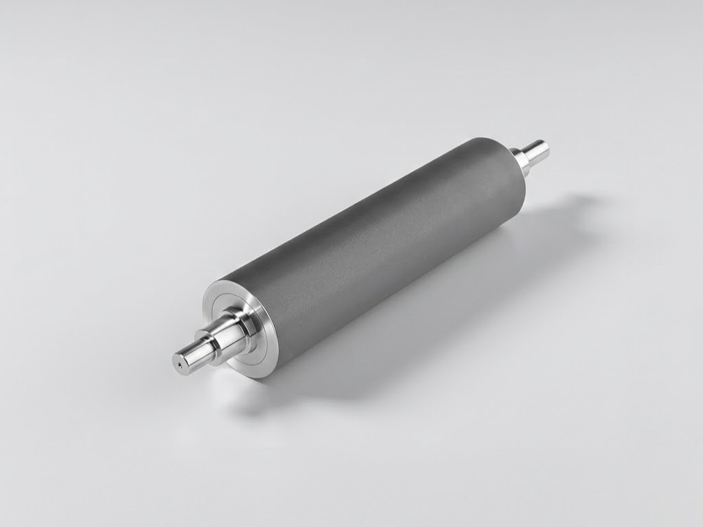
Fleksografik uygulamalar için Kete, baskı basıncı üzerinde benzersiz bir kontrol sağlayan ve nokta kazanımının etkilerini önemli ölçüde azaltan gelişmiş servo tahrikli sistemler kullanmaktadır. Makinelerimiz, hassas ve tutarlı bir mürekkep hacminin plakaya iletilmesini sağlayan yüksek performanslı seramik aniloks silindirlerle donatılmıştır ve bu da ince yarı ton noktalarının istikrarlı bir şekilde çoğaltılmasına olanak tanır.
Rotogravür hattımızda, yüksek hızlarda ve zorlu alt tabakalarda bile eksik nokta riskini ortadan kaldıran yüksek stabiliteye sahip sıyırma bıçağı tertibatları ve gelişmiş baskı silindirleri uyguladık. En önemlisi, Kete'nin entegre otomatik renk kayıt sistemleri, CMYK plakalarının hizalamasını gerçek zamanlı olarak izlemek ve ayarlamak için yüksek hızlı optik sensörler kullanır. Bu kapalı devre kontrol sistemi, presin mekanik senfonisinin mükemmel bir uyum içinde kalmasını sağlayarak ilk metreden son metreye kadar tutarlı, yüksek kaliteli proses rengi sunar.
Profesyonel İpuçları: Tutarlı Sonuçlar için İş Akışınızı Optimize Etme
Profesyonel düzeyde proses rengi elde etmek için operatörün baskı makinesinin ve tüm üretim ekosisteminin ötesini görmesi gerekir. Dört renkli reprodüksiyonun doğruluğu kimya, fizik ve mekanik stabilite arasındaki ince bir dengedir.
Renk Doğruluğu Üzerinde Substrat Etkisi
Proses renk noktalarının optik davranışı, ister polimer bazlı ister selüloz türevli olsun, taşıyıcı malzemenin fiziksel özellikleri tarafından belirlenir. Endüstriyel ambalajlarda mürekkep yoğunluğu konusunda herkese uyan tek bir tutum, feci renk değişikliklerine neden olur.
BOPP, PE ve PET gibi farklı alt tabakalarda mürekkebin yapışması ve ışık yansımaları farklı zorluklar ortaya çıkarmaktadır. Örneğin, PET renk canlılığının daha canlı olmasını sağlayan yüksek netlikte bir yüzey sunarken, PE doğal esnekliği nedeniyle CMYK katmanlama işlemi sırasında kayıt kaymalarını önlemek için yüksek düzeyde gerilim kontrolüne ihtiyaç duyar. Öte yandan kağıt ve karton gözeneklidir; mürekkep liflere nüfuz eder ve aşırı nokta kazancı ile proses rengini yapay olarak koyulaştırabilir. Renkte ustalaşmanın anahtarı alt tabakada ustalaşmaktır.
Kritik İş Akışı Ayarlamaları
Substrat Ön İşlemi: Alt tabakanızın doğru yüzey gerilimine sahip olduğundan emin olun. Plastik filmler için, proses renk noktalarının yapışmasını ve kontrolsüz bir şekilde yayılmamasını sağlamak için korona işlemi gereklidir.
Viskozite Kontrol: C, M, Y ve K mürekkeplerinin "yapışkanlığı" ve viskozitesi dengelenmelidir. Macenta mürekkep Camgöbeğinden önemli ölçüde daha inceyse, mürekkep yakalama sırası tehlikeye girecek ve öngörülemeyen renk kaymalarına yol açacaktır.
Çevresel Kararlılık: Sıcaklık ve nem hem mürekkep kimyasını hem de alt tabaka boyutlarını değiştirebilir. İklim kontrollü bir baskı odasını muhafaza etmek bir lüks değil, yüksek hassasiyetli proses renk çalışması için bir gerekliliktir.
Düzenli Kalibrasyon: Aşağıdakileri izlemek için spektrofotometreler kullanın L*a*b* Çalışma sırasında proses renklerinizin değerleri. Çıplak göze güvenmeyin; CMYK çıktınızın hedef tolerans dahilinde kalmasını sağlamak için verilere güvenin.
Sonuç
Proses renk, görsel çok yönlülük ve ekonomik ölçeklenebilirlik arasında sofistike bir denge sunarak modern baskı endüstrisinin temel taşı olmaya devam etmektedir. Üreticiler, CMYK modelinin altında yatan fiziği ve yarım ton reprodüksiyonun mekanik zorluklarını anlayarak küresel ambalaj taleplerinin karmaşıklığını aşabilir. Nokta kazancı, kayıt ve alt tabaka etkileşiminin zorlukları önemli olsa da aşılamaz değildir. Kete yaklaşımını tanımlayan ilkeler olan yüksek hassasiyetli mühendislik ve titiz iş akışı optimizasyonunun uygulanmasıyla, proses renginin potansiyeli tamamen ortaya çıkar ve basılan her görüntünün endüstriyel mükemmelliğin ve teknik ustalığın bir kanıtı olmasını sağlar.