The bridge between a digital design and a physical product in the complicated world of industrial printing is constructed on the very important decision of color reproduction. This choice is not just a question of taste but an essential technical pledge that determines the mechanical configuration of the press, the economic form of the project, and the ultimate fidelity of the brand identity.
Being professionals who work in the field of packaging, we have to consider the advantages of the two main systems, spot color and process color. To choose the right method, an analytical knowledge of the interaction of ink with substrates and the perception of chromatic information by the human eye is needed.
What is Spot Color
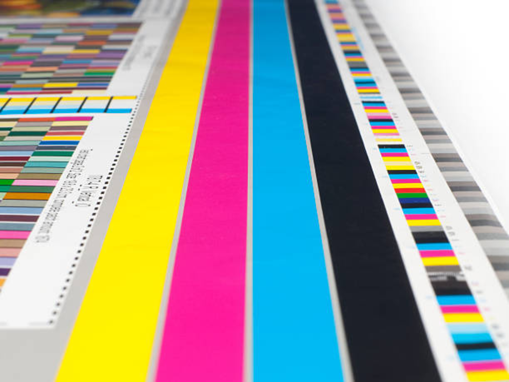
Spot color is a printing technique in which a particular, single ink is developed and blended prior to it being applied to the printing press. The color in this system is not formed by the interplay of various inks on the paper or plastic, but it is a pure signature of a particular pigment mixture. The best-known standard in this is the Pantone Matching System (PMS colors), which offers a universal language to printers all over the world. In a design that requires a spot color, the press operator loads a special station with that specific premixed ink. This makes the color completely solid and uniform without the microscopic dot patterns that are characteristic of other processes. It is the gold standard of high-saturation requirements and absolute chromatic consistency in different production runs.
What is Process Color
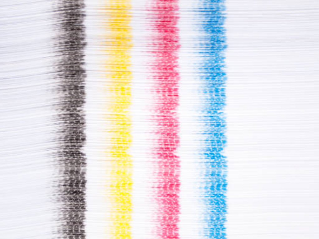
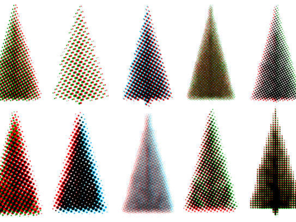
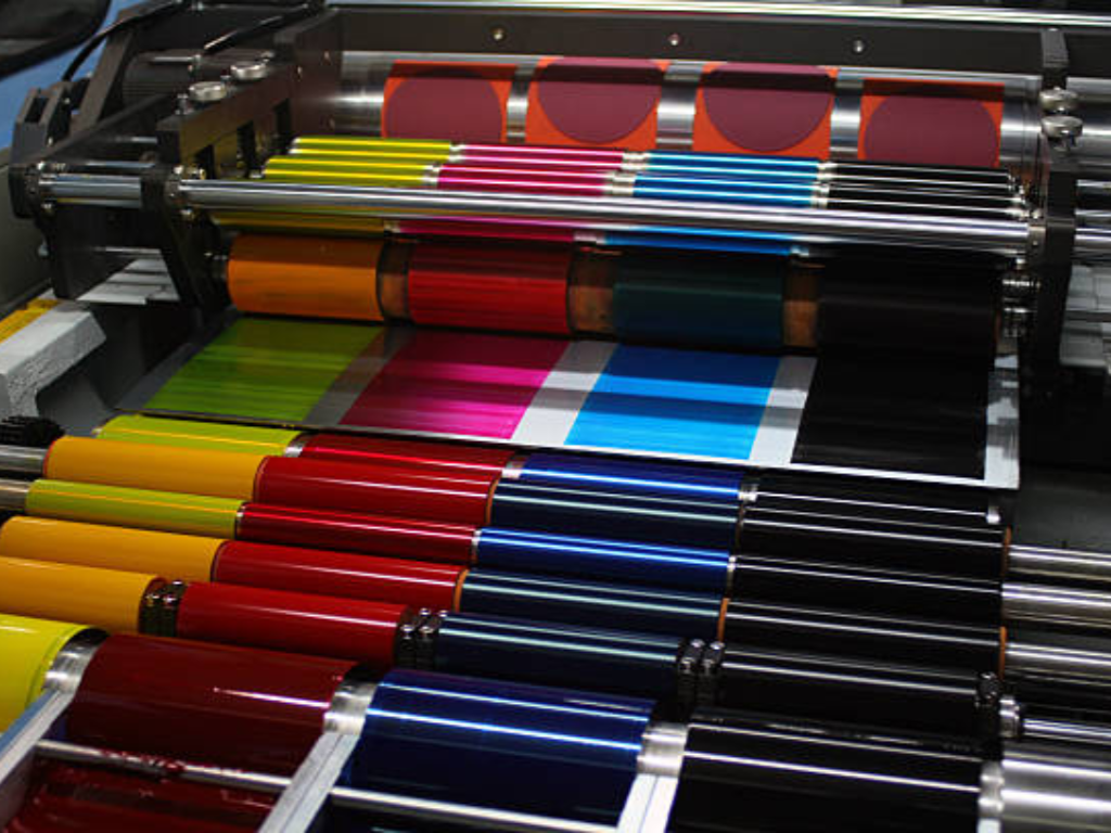
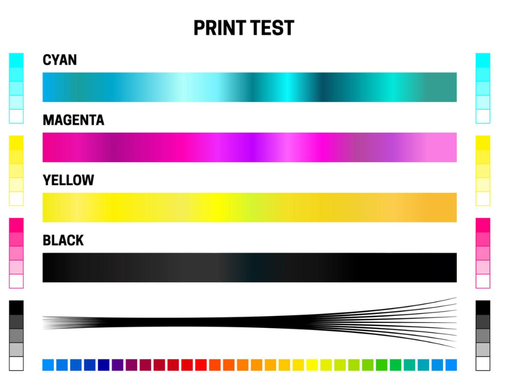
Process color printing, also known as CMYK, is based on an entirely different mechanical and optical principle. It uses four standardized ink colors, Cyan, Magenta, Yellow, and Key (Black), to recreate a large range of the visible gamut. The press does not use a pre-mixed ink in each shade, but rather in a sequence of microscopic dots of halftone inks. When these dots are printed closely together or overprinted on each other, they act as a chromatic mosaic, and the human eye is fooled into thinking that it is a solid, continuous tone. It is based on this subtractive color model that modern commercial printing is possible, where complex imagery and full-color photographs can be reproduced using a fixed set of four printing plates, no matter how many thousands of different hues are in the original image.
Spot Color vs. Process Color: A Side-by-Side Comparative Table
In order to generalize the technical differences above, the following table gives a direct comparison between the mechanical and optical parameters that govern these two printing methodologies. This analytical model is used as a reference point in making informed decisions in production.
| Technical Attribute | Spot Color (PMS) | Process Color (CMYK) |
| Ink Mechanism | Pure, pre-mixed singular ink formulation | Optical layering of Cyan, Magenta, Yellow, and Key (Black) |
| Press Configuration | Requires one dedicated printing station per unique color | Utilizes a fixed set of four standard printing stations |
| Visual Microstructure | Appears as a continuous, solid ink film under magnification | Appears as a mosaic of microscopic halftone dots |
| Цвет Saturation & Gamut | Extremely high; capable of reaching “out-of-gamut” vibrant hues | Standardized; limited to the achievable CMYK color space |
| Primary Application | Corporate logos, brand-specific identity, and large solid backgrounds | High-resolution photography, complex illustrations, and deep gradients |
The Visual Showdown: Precision, Consistency, and Special Effects
In comparing these two systems from a strictly visual perspective, the difference lies in the precision and versatility of specific ink colors. The professional printer realizes that the right decision will be based solely on the character of the graphic elements being reproduced and the conditions under which the end product will be operating.
Brand Integrity and Color Accuracy
Color is an essential element of intellectual property to global corporations and established brands. A certain blue or red color is associated with the brand itself, and any deviation, even the slightest one, can destroy consumer confidence and brand awareness. Here, spot color comes in handy. Since a spot color is one, pre-mixed ink, it removes the variables of the four-color process. In CMYK printing, a small mechanical movement in the positioning of the plates or a small change in the density of ink on the Magenta station can result in a brand that is supposed to be orange leaning towards red or yellow.
In spot color, the ink is the same from the first meter to the ten-thousandth meter. Moreover, spot colors have the ability to be of high-vibrancy, which is beyond the gamut or range of the CMYK system. Some of the deep purples, bright oranges, and vivid greens cannot be reproduced by a combination of four standard inks. When the project needs absolute color fidelity that needs to be identical on various substrates, e.g., a corrugated box, a plastic label, and a paper insert, spot color is the sole technical route that ensures a cohesive visual identity.
Handling Complexity: Photos, Gradients, and Detailed Graphics
Although spot color is good at uniformity, it is necessarily restricted when confronted with the complexity of the natural world, which has its own drawbacks. Even a high-resolution picture of a landscape or a piece of fruit has millions of minor color transitions, shadows, and highlights. Mechanically, it would be impossible to load a different ink on each variation of a photo. This is the world of process color (CMYK).
A CMYK press is able to reproduce the gentle fade of a sunset or the fine details of the skin of a human being through the advanced use of halftone screening. The geometry of these dots has been perfected by modern high-performance printing machines to the point that the human eye cannot see the individual points of ink without the assistance of a magnifying glass. In projects that require intricate illustrations, detailed textures, or photographic details, full color process color offers some degree of versatility and realism that spot color could never aspire to achieve. It is usually a question of the structure of the design: whether it is a solid form and logos, then spot; whether it is a window into the real world, then process.
The Economics of Printing: Plate Costs vs. Run Length
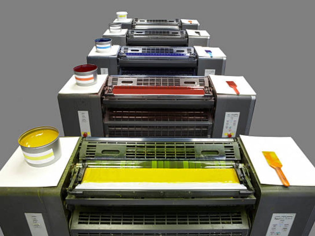
Technical excellence in the industrial sector should never be unbalanced with economic reality. The pre-press phase of a printing project is one of the most critical factors in determining the cost structure of the project, namely, the production of printing plates. Every color in a design must have its own plate and a station on the printing press.
The number of plates is always four in a process color (CMYK) job. Whether you have five colors in your design or five hundred, the mechanical requirement is the same. This provides a predictable cost base for complex imagery. On the other hand, spot color prices are linear: the more spot colors you use, the more plates you need to print, and the more time the press operator needs to wash and ink the stations. When a design has six spot colors, it will need six plates and six setup processes.
The calculation, however, varies with the run length or the volume of the print job. In short-run projects, CMYK initial setup and plate costs are usually more cost-effective. However, in large, industrial-scale production, spot color reliability can actually save waste. Since spot color is simpler to track and hold over time, the make-ready time and the quantity of substrate wasted in making color changes is usually less than in a complicated four-color system. The break-even point is a calculation that a professional should make, in which the increased initial cost of multiple spot plates is compensated by the speed and consistency of the production run.
Beyond Standard Colors: When You Need Metallic and Neon Finishes
In the packaging and label design, there are times when the standard pigments cannot be used to attract the attention of the consumer. This is especially so in the luxury goods, cosmetics, and high-end beverage sectors where metallic brilliance or neon vibrancy is needed to make a product stand out on a crowded shelf, ensuring the corporate colors are consistently represented.
The CMYK process technically cannot create any real metallic or fluorescent effects. A gold in CMYK is simply a mixture of yellow, magenta and black dots that are supposed to replicate the look of gold at a distance; it does not have the reflective qualities of metal. Specialty spot inks are required to create a true, shimmering metallic silver or a glowing neon pink. These inks have real metallic flakes or fluorescent pigments that respond differently to light. Since these pigments are physically dissimilar to normal inks, they have to be used as a solid spot color by a special station on the printing press. This gives it a touch and visual refinement that instantly conveys to the final consumer that it is of high quality.
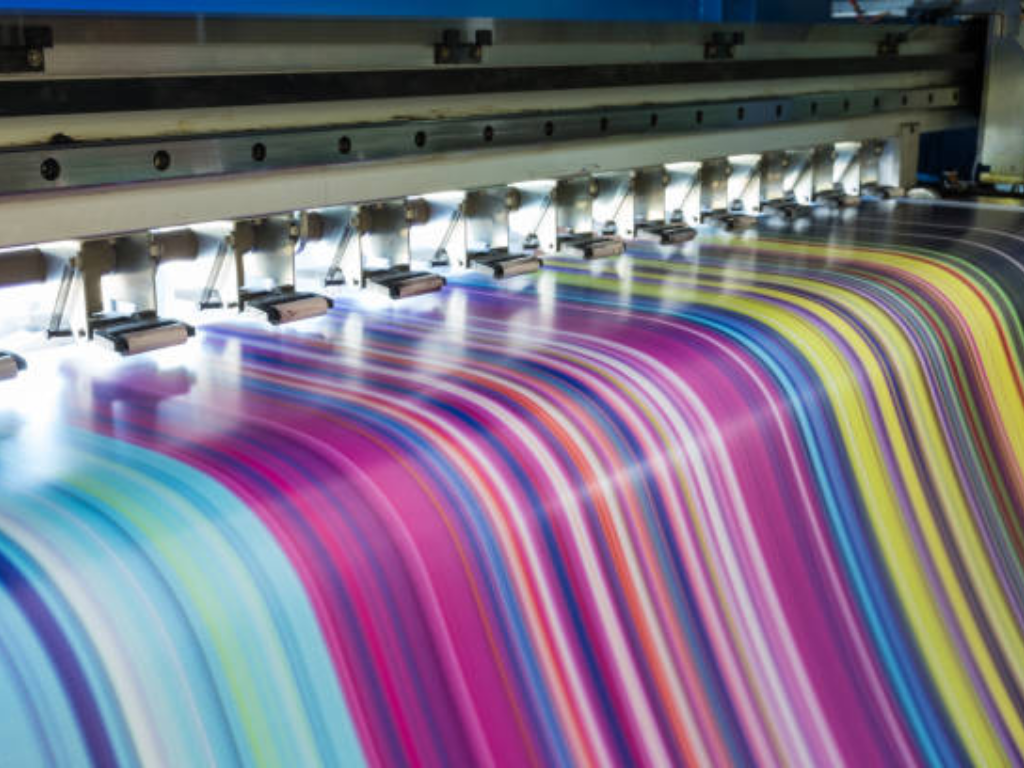
From Design to Reality: How Equipment Precision Dictates Your Color Quality
However careful a choice of color, however costly the ink, the ultimate outcome is always determined by the mechanical accuracy of the printing press. Printing is a rapid micro-mechanical exercise in the physical world. The ink has to be transferred out of the fountain to the anilox roller, then to the plate, and then to the substrate, and all this when the material is flowing at hundreds of meters per minute.
Without structural rigidity or high-precision registration controls, the benefits of both spot and process color are lost. Poor registration in process printing causes images to blur or have color halos. Uneven pressure may cause mottling or uneven ink density in spot color printing, destroying the solid effect that spot color is supposed to give. The machine is the ultimate judge of intent, which the expertise of the printer is executed.
Achieving Precision with KETE High-Performance Printing Machine
The bridge between a digital conceptualization and a flawless industrial product is defined by the mechanical integrity of the printing press. With over years of manufacturing excellence, KETE engineers solutions that resolve the inherent tensions between CMYK versatility and spot color precision through various concentrations.
The cornerstone of KETE’s CI Flexo technology is the massive central impression drum. By stabilizing the substrate in a fixed position across multiple color stations, the system achieves exceptional registration accuracy—a critical requirement for high-definition color process printing, where even microscopic shifts result in visual blur. Furthermore, KETE’s advanced inking systems are calibrated for a wide spectrum of viscosities, effortlessly managing the heavy pigments characteristic of metallic and neon spot colors that often compromise the performance of standard equipment.
Whether executing high-speed, 8-color Pantone-heavy jobs or complex photographic CMYK runs, KETE platforms minimize mechanical vibration to ensure the final output remains consistent and achieves accurate color from the first meter to the last. This operational stability facilitates reduced material waste and optimized production margins. Beyond the printing machines, KETE’s service philosophy fosters a partnership rooted in technical insight and personalized expertise, ensuring every capital investment aligns with rigorous long-term production goals. Elevate your operational standards with KETE—where industrial reliability meets chromatic perfection.
Practical Decision Checklist: 5 Questions to Ask Before Printing
Does the design have a particular brand Logo that has to be a perfect match to a Pantone chip? In case the answer is yes, at least one spot color is strongly suggested to provide brand integrity.
Does the artwork have high-resolution photos or complicated color gradients? In that case, the main requirement of realistic reproduction is a CMYK process color setup.
Is the project metallic, fluorescent or high-opacity white ink needed? Such effects cannot be physically achieved in CMYK and require specialty spot colors.
How many units are in the production run? In extremely large runs, the uniformity and reduced wastage of spot color can be more than the initial expense of additional plates.
What is the target substrate? Ink does not take up on porous materials such as brown kraft paper as it does on glossy plastics. Talk to your machine specialist about the ink system that will give you the best density on your material.
Заключение
The decision between spot color and process color is not always a dichotomy, in the contemporary world, the most successful projects tend to be a hybrid one, with the photographic realism of CMYK and the surgical accuracy of a spot color to represent the logo of the brand. This technical synergy needs not just a thorough knowledge of the color theory, but also a collaboration with an equipment manufacturer that knows the demands of the pressroom. With the correct approach and the backing of the high-precision engineering of KETE Printing machine, you will be sure that your project will not stay in the documentation phase but will enter the sphere of professional excellence. The end result is a product that will appeal to the consumer with the silent, effective language of perfect color.